Showing posts with label Vera Bradley. Show all posts

Tuesday, June 10, 2014

Breast Cancer Blunder

Many thanks to FinleytheWestie, I TOTALLY forgot to talk about the Breast Cancer Foundation print situation that was going down a while ago.

Oooooopssssss!

As we all know, Vera Bradley has a selects a pattern that will represent their Breast Cancer Foundation. A portion of the purchase of anything in that print will go to breast cancer research. They've had 11 prints represent the cause so far, Pink Elephants being used twice as it was resurrected this past November.

So for a little while, it was believed that the new BCF print was going to be Petal Paisley, it made sense since the color scheme was exactly the same as Ribbons, just bigger emphasis on the played down colors of Ribbon (less blue, more green).

HOWEVER....that wasn't the case. Petal Paisley was released with no additional fanfare (*snort* get it? Fanfare? I crack myself up), and we were all wondering what the dealio was.

Around this time, a slew of talks about hybrids started popping up, and the focus was more on the Disney hybrids of Mickey's Hidden Petals (Flower Shower hybrid) and Bouncing Bouquet (Clementine hybrid) .

But wait a minute! Why are you talking about hybrids when the original topic was breast cancer awareness prints????

Well, I'm talking about hybrids because that what the new print is. As a result of the hooplah over the other prints, the true BCF print was a little overshadowed (at least in my opinion). Well.....here it is:

INTRODUCING.....
PINK SWIRLS

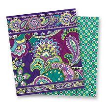
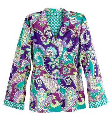
This print is a pink version of Heather. So not a total hybrid, more of a re-coloration of a former print. Not a new technique on VB's part, but a good one. I am sooooo feeling this print! Supposedly this is coming out when the first batch of fall colors are released in a few weeks....

So, who's feeling the new print?!?!

Thursday, February 6, 2014

Upcoming Promos - February

Hey guys! I've been a little MIA for a bit, but I'm still a Vera-land citizen!
Here's the scoop for February promos:

February 6th– 13th

Clear Beach Tote & Flip Flops Promotion:
Purchase a Clear Beach Tote ($68) and receive a pair of Flip Flops for just $1
Regular price is $24


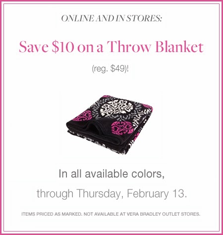
Throw Blanket Promotion:
Save $10 on a Throw Blanket of any color
Regular price is $48

 February 14th-17th
Paired Promotion
Receive both a Mandy ($70) and a Turn Lock Wallet ($49) for only $79 (Save $40) 
and/or 
Receive both a Grand Traveler ($120) and a Grand Cosmetic ($42) for only $120 (Save $42). 

February 20th
Getaway Duffel Promotion
Get the Special Price of just $68 on a Getaway Duffel through March 1st while supplies last. 
Regular price is $88

Monday, December 30, 2013

Spring 2014 Release coming up!

It's coming, Vera-land Citizens!

The release date of the Spring 2014 prints is January 9, 2014!

WHATTTTTTTTTTTT!

That's almost 2 weeks from now! 

Who's excited?!

Friday, September 6, 2013

Spring 2014 Preview...Oh Em Geez...

Well, the past few days have been pretty live in the Land of Vera! Why, you ask?

BECAUSE IT'S PREVIEW TIME!!!!

As of yesterday, the Spring 2014 prints will be previewed in select Vera Bradley stores. Thanks to the fabulous VeraObsessed and lisalovesverabradley, we all were able to sneak a peek...and I am confident in stating that these prints are FABULOUSSSSSS!!!!

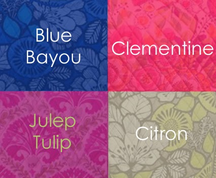
Prepare your bodies for:

Julep Tulip

Clementine

Blue Bayou

Citron


Can I just say WOAH? Firstly, this has to be the first time that ALL the prints released for the season dazzle me. Usually each batch has one print that I'm not too crazy about, a.k.a. prints I HATE (Tutti Fruiti, Lola, etc.) but I have absolutely NO COMPLAINTS about this batch! That's not to say that no one else will have gripes (my sis thinks Citron should be called 'Kiwi-tron'...she's 12 btw) and I can totally see it, but I'm not averse to any of these.

A first. 

My absolute favorite at the moment is Clementine. How can it not be? It's totally gorge! It looks like a print I can take out on a park picnic and have a glass of lemonade with. The colors scream "Springtime", and the interior is equally beautiful. It reminds me of snakeskin, with the diamond pattern. HOWEVER...Julep Tulip is giving Clementine a run for it's money. These colors remind me of my BFF's wedding colors (that berry-like purple and the olive green)...I'm wishing this print came out LAST year, she gave us gifts that coordinated with the colors, and a cute cosmetic pouch or accessory would have gone nicely, I think.
Can you see it???
Now, this Blue Bayou for some reason reminds me of Hawaii....when I think of the word 'bayou' I think of Louisiana...and this print, to me, is more of a 'lagoon' if that makes sense. 
Bayou
 vs.
Lagoon

But word definitions aside, this print is very striking! The white flowers and leaves seem to pop out against the bold blue background. Its definitely a print I can see at the beach or on a cruise vacation...anyplace with water.

Now if I had to rank these based on the color schemes, Citron would be considered my least favorite of the 4. I like this print and would definitely consider it for a wristlet or traveling tote, but when you compare it to the other three, it definitely falls behind. With that being said, Citron has it's plus factors: it would look great against a pair of jeans, and I for sure can see it being used for a work tote; the dark grey wouldn't get dirty as fast as the others. It definitely jumps up the ranks when you're rating them for practical use. 

Each bag has an interior to die for, very complimentary and if you were so bold you could rock the bags inside out and no one would know. 

All in all I'm very pleased with the upcoming prints...Clementine is supposed to be getting an extra-special preview again in December so stay tuned, fellow citizens!

Side note: be sure to check out all the cool Citizens of Vera in my sidebar! I get a lot of info and incite from these gals *waves to vera-vera-vera*, and they know their Vera! Pop over and say hey!

Thursday, June 27, 2013

Fall 2013 is here(kinda)!

This is it!

Vera released the Fall 2013 Campus items, and added a really cute video to show off their stuff!


SQUEEEEEEEEEEEEEEEEEEEEE!!!!!!!!

Although Lola is still not my cup of tea, the other colors are really cute. Heather is officially going to be my pick of the season!
Cute! Cute! Cute!

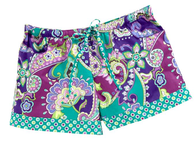
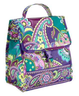
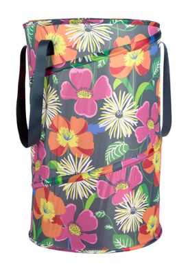
There were so many new items shown, I can't wait until July 9 for the official release of the items. From what I see, theres going to be a new lunch bag, this really cool backpack/tote hybrid, and even laundry hampers and pajamas!

What I am most excited for is the friggin bedding (but I have to wait until July 18 *cries*)! You have NO IDEA and I saw some throw pillows in that video! The bedding preview was what made me fall for Heather in the first place. I was a little nervous because I didn't think they would have queen size sets, but my fears have been put to rest, there were some pretty big beds in the video.

Plus Primo Vera had a sourcebook sneak peek and there were queen size sets shown. She has so many pictures of the new items, you HAVE to check it out!
FRIGGIN THROW PILLOWS I CANNOT!

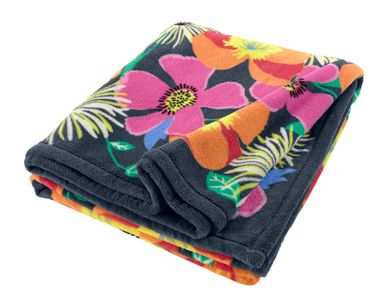
On another note, I'm very happy to see Jazzy Blooms is included in the new items as a print. I can guarantee that my new apartment will be JAZZY BLOOM-ED OUT!
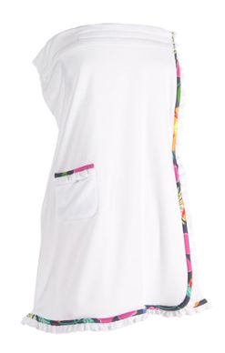
There's the hamper, a wrap towel, a throw blanket, and I'm sure in 2 weeks there is more where that came from!

Who else is psyched for this release?!?!?!!?!

Thursday, June 20, 2013

No School like the Old School

So last month Vera Bradley had allowed us to sign up to receive mobile updtes and promotions, and I'm sooooooo glad I did!

A few weeks ago, a friend and co worker of mine had brought in her very first Vera bag, a cute brown and blue tote that had been seen a lot of love and use over the years, and it was adorable! She didn't know the name of the print, only that when she bought it, it seemed that it was never seen again!

If you know me at all, you know that I took this as a mystery to solve!

Turns out, the pattern was Java Blue, one of the flyest patterns I've ever seen!
I absolutely fell in love with it, I'm looking for a good price on ebay for a tote in this as we speak.

But I'm sidetracking, back to the topic...

SO it was just a huge coincidence that I get this text today...

....and when I get there, I almost scream out loud because lo and behold, Java Blue was one of the colors on this new Hybrid Phone Case for the iphone!!!!


Clockwise from top right: Java Blue, Sherbert, Pink Elephants, and Petal Pink

I love this Hybrid case, the one I have is just the snap on for the iphone 5, and although it surprisingly has protected my phone well, there are still some vulnerable area on the bottom and side with the buttons. With this new case, the buttons are covered and less space is out at the bottom, I love it.

I also love that they are bringing the old school colors back, gotta love Vintage Vera! I think I'll be gettin a Java Blue and Petal Pink case...

They will be available starting June 21!

Wednesday, May 22, 2013

Winter 2013 Preview

*peeks in*

Hello All!

Life's been kinda crazy the past month, I'm moving into my own first apartment, so I've been 100% focused on that. HOWEVER, thanks to A Very Vera World and VeraObsessed, I did happen to see that there was an in store preview for the new Winter 2013 prints.

Canterberry Magenta, Canterberry Cobalt, and Venetian Paisley


First, I'd just like to say that unless I've missed something, there are still 3 other patterns floating about the universe with no release date (again, please correct me if I'm wrong, I want those prints to come out!)

Second, since the confusion started last month, I didn't really give my take on these new prints. I have to say that I'm not totally blown away. The Canterberry prints are nice, I could see them being good for a work bag, you can kind of match the Cobalt one with a lot of things. They actually remind be of Baroque with the black, white, gray patter with a little pop of color.

Now on to this Venetian Paisley....although that paisley design is growing on me (slowly), I am not fond of these colors mixed in. Its like an inverted version of Tutti Frutti, and I don't like that print unless it's on cute little baby booties.

I do love the interior of the bags though, especially Venetian Paisley's. I would definitely rock it inside out with no shame.

Again, not blown away. I'm still in love with older prints, and they're NOT trying to give me my Olivia Pink, so no New Print <3 for this....for now.

The next Vera item I'm looking to purchase will be bedding for my apartment, I'm plotting hard on that Heather set ^_^ hopefully I get some cute Vera housewarming gifts!

Thursday, May 2, 2013

More Prints from Another Survey

So I'm browsing Tumblr and I come across someone who also had a survey and got some different prints...


 Soooo I don't know about YOU guys but I'm loving these more than the first group!

#1 is different, a little OD on the neon green...
#2 is simple and very pretty.
#3 I LOVE, I think it's the cutout stroke around the flowers that do it, like they're stickers!
#4 I ALSO LOVE! Olive green is one of my fave colors and I'd die if that were a chosen print!
#5 is another artsy one, it's flowers that aren't shaped like flowers. Kinda cute, good for a Kindergarten or children's Art teacher!
#6 reminds me of Very Berry Paisley...but it's not...

Anyone else get different colors on their survey? (And how can I get down with these surveys?!?!?!)

Monday, April 15, 2013

The Missing Three (the Fall/Winter mixup)

A thousand apologies guys, sorry I've been away for a while but life got a little nutty for a bit there....

ANYWHOO

JUST when I thought I had gotten a hang on things as far as Vera releasing prints, I get thrown for another loop! I was a little confused a few months ago when the Fall 2013 preview had 6 colors (pictures credited to Alison from Oh My Vera!, who gets the juicy scoop before us all!!!!!)


(Top: Cocoa Moss, Heather, and Lola / Bottom: Olivia Pink, Bittersweet, and La Neon Rose)

At first I assumed all the prints would be released at the same time, and I thought "Woah that's a whole lotta prints for one season". But then the Back to School ads started getting leaked...


..... and there were only 3 out of the 6 prints shown (and Olivia Pink was NOT one of them!!!). Soooo then I started to wonder what the heck was going on with those other prints? Were they being released later? The next season?? Are they being released at all??????

To make things even more confusing, there was a release saying that there were 3 MORE prints being released in Winter 2013....

...so now I'm having a full blown panic attack, because once AGAIN there is no Olivia Pink and whatinthehamsandwichisgoingonnnnnnnnnnnnnnnnnn?!?!?!?!?!?!

On top of that, yesterday Sarah from A Very Vera World posts this email she got from someone, an email that pretty much says that the prints that I now dub The Missing Three are the true Winter 2013 prints...


...


Can someone please just lay out this bag of snakes for me! I actually like those Canterberry prints so what's going on with them? Where the heck are The Missing Three?!?! 

WHERE ARE THEY??????