Showing posts with label Summer 2014. Show all posts

Thursday, March 27, 2014

Happy Birthday to ItLoV!

Soooooo one year ago today, little ol' me sat down and started a little ol' blog about a brand that captured my interest. One year ago today, In the Land of Vera was born!


One year ago today, I began my rambles about Vera Bradley; the prints, the items, and the sheer joy I got when news came about! I met some new people with whom I could share my love/obsession/fangirling with, and it's been a blast!

In honor of ItLoV's 1 year anniversary, I'm posting a super post about all the things that have been going on:

First thing's first: the summer release...it seems like it came super fast. Last year's summer release was in March too, but I think it was more in the middle of the month...I dunno maybe time is flying by for me because I've been so engrossed with schoolwork and my day job's work....*sigh* one more semester...
Anyways...Summer 2014 was released and it was all that I'd wanted it to be...


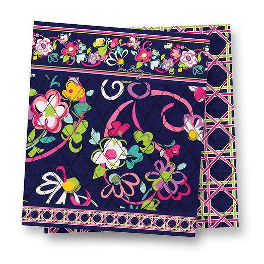
Yes! Fanfare, Flower Shower, Flutterby, and Petal Paisley are here! Now that we have official swatches, my favorite out of the group is hands down Petal Paisley, it's the new version of Ribbons to me, but only in the sense of the two prints having the exact same color scheme. There is nothing wrong with that, because I loved Ribbon's colors, so now I won't have to scramble and stock up when Ribbons is retired....unless they decide to retire Petal Paisley in 3 months like they've been doing recently (remember La Neon Rose y'all?) What's your favorite print guys?

But now that we're on the subject of Petal Paisley, I'm super disappointed that it's not going to be the new breast cancer print. WHY NOT? Who the heck knows, according to my VGM VeraObsessed, it's supposedly one of the new Fall 2014 prints. I'm mad at this, because Petal Paisley would have been PERFECT since it's another version of Ribbons, the current breast cancer print. It just would have made sense.

Speaking of Fall 2014 prints...in due time people. I think they're still under wraps so I'll wait till I get the OK to talk about them. Let me just say though that I'm excited for them!

Moving on...

The new baby line!!!!!!!


Adorbs! Positively adorable! Gah these are one of those times where I wish I had kids right now, because it's an official fact now that they are planning on discontinuing the baby line in the fall. DEPRESSED. I AM DEPRESSED. Look at these chubby legged little babies rocking Vera! Why would you stop this????

So stock up now (like I will be doing...for the future of course) because come fall they will be goners :-(

Okay...now for a big one...this is a biggie...

Vera has paired up with another retailer to cause me to just make a bed in the poorhouse. They've teamed with UNIQLO to make shirts with Vera patterns.

Okay...so I'm in LOVE with the tunics. I'm a tunic-loving fool, and I can wear them all year round. In the summer with some shorts or over my bathing suit, in the other seasons with a light sweater over it and some leggings. Tunics are my comfy clothes. However...not a fan of the tees. I don't know, they could have done some sort of pattern play with the tees, or maybe just not slap the print on a tee and that's it. The idea works for the tunics, but not the tees for some reason. I dunno.

I'll be back later to discuss more news....my bf's dragging me away from the laptop...

Laters,

Shay

Thursday, December 5, 2013

Finally Flower Shower

Howdy! Hope everyone's thanksgiving was good and fat! Now, let's talk Vera!

So last month I gave my opinions on most the Summer 2014 colors, but not all because I wasn't able to get a pic of Flower Shower on merchandise. I have one now!


Now I can see colors clearly. At first I thought the background was sort of grey, now I can tell it's brown. I get the "shower" concept with the dotted streams. There are a few elements in this pattern that remind me a little of Canyon; the dotted circles, the heart shaped flower petals, and of course the brown (although Flower Shower's is much duller) and the orange.

However, I'm still not interested in this pattern. I don't know, maybe it's the color scheme all together, I'm just not into this. What about you guys? You like? If so, why? I feel like I'm not getting it.

Thursday, November 14, 2013

Seeing Summer 2014 on Glenna

So my girl Donna blessed me with some sneak peeks of the Summer 2014 prints! And she gave them to us in the form of Glenna! The Glenna is a really good go-to bag for everyday activity. Not too big, but plenty of space inside. There is a Glenna in CaMa on my list that I'm HOPING Santa is looking at ;-)

Remember when I said that sometimes I needed to see the prints on merchandise before I can make my final judgement? Weeeellllll I had to in the cases of Flutterby and Petal Paisley. Here is the original preview:


aaaand here they are on merchandise:

When I first saw Flutterby, it didn't really call to me. I recall saying I had no real comment on it, and that was true. It seemed like something I'd buy for my 12 year old sister. Purple, purple EVERYWHERE...it gave me a toothache. I didn't hate it, I just didn't love it.

Looking at it now, I do like it. It's adorable. It screams SUMMERTIME. I can see it in a park at a barbecue or even poolside on a really hot afternoon. The dark purple background tones the sweetness down a little so that saved it.

Will I buy this? Probably, but again, for my sister. I have my eye on another print. Would I keep it if it were gifted to me? Absolutely!


Now, Petal Paisley...this one was a little tricky. When I first saw the preview swatch, I compared it to a survey print from a few months ago that I liked. In my head, I kept seeing the survey print instead of the actual Petal Paisley print.

When I actually took time and looked at PP again, I wasn't too jazzed about it. It was very busy for me, and once again I had to hold my opinion until I saw it on a bag, or wallet, or something!


Looking at it now...I may or may not be in love. It reminds me of Ribbons with the color scheme. I see the dark blue background, the pinks, that teal green, and white.  I bet when we get the actual swatch for PP they will have the same colors. It's the colors that are doing it for me. You all know I don't love paisleys, but it's the colors they use in them that make the difference.

Fanfare I still love! Vera is in need of a new black and white pattern, right? The last one was Night and Day(I'm not counting Camellia, there was a lot of grey in that), which is now retired. Night and Day was black and white and that was IT.


Well Fanfare fits the bill! It's style is what I like to call  fancy-pants, it's quite elegant, to me at least. Yes, it has a small splash of yellow but it's still simple enough. I can see this being a nice accessory print for a nice night out. It's very subtle, not busy like some of the others.


Unfortunately she didn't have a photo for Flower Shower. I haven't see it on anything yet...so right now it's still thumbs down for me. I didn't like it when I saw it, but maybe I'll be pleasantly surprised :-)

Tuesday, September 24, 2013

Summer 2014 Sneak Peek

*peeks in*

pssst.....guess what I've got?

SUMMER 2014 PRINTS!!!!!!

OH, how I love VeraObsessed! She has the scoop on all things Vera lightyears before any of us citizens, she's like the Anderson Cooper of VeraLand! She gave us this little gem the other day:


I've seen Flutterby before, but these other ones are new to me. Petal Paisley looks a little like one of the survey prints from a few months back, right? Same color scheme:

Just like this survey print, it's a paisley that's made out of flowers. I was never crazy about the paisley, but this makes me like it. I liked that survey print, and I have a feeling I'm going to like this one too... plus it has pink! I love pink!

Flutterby is very girly, when I look at it I think of candy for some reason. It just screams 'sweet' to me. No real comment yet on it though...

Fanfare looks very frenchie, like it should be wallpaper in this Parisian themed restaurant in Manhattan that I've eaten in. It's cute, can't wait to see it on some bags...but since it's white background I can see it getting dirty fast. It's probably a good accessory print.

Flower Shower is a little much right now. It's literally a shower of flowers, like Va Va Bloom, but it's a little excessive. I'd have to see it on something to make a final call.

Not kicking down the door for these, but I can see myself owning some new Vera prints next summer.

What do you guys think?