
So my girl Donna blessed me with some sneak peeks of the Summer 2014 prints! And she gave them to us in the form of Glenna! The Glenna is a really good go-to bag for everyday activity. Not too big, but plenty of space inside. There is a Glenna in CaMa on my list that I'm HOPING Santa is looking at ;-)
Remember when I said that sometimes I needed to see the prints on merchandise before I can make my final judgement? Weeeellllll I had to in the cases of Flutterby and Petal Paisley. Here is the original preview:

aaaand here they are on merchandise:
 When I first saw Flutterby, it didn't really call to me. I recall saying I had no real comment on it, and that was true. It seemed like something I'd buy for my 12 year old sister. Purple, purple EVERYWHERE...it gave me a toothache. I didn't hate it, I just didn't love it.
Looking at it now, I do like it. It's adorable. It screams SUMMERTIME. I can see it in a park at a barbecue or even poolside on a really hot afternoon. The dark purple background tones the sweetness down a little so that saved it.
Will I buy this? Probably, but again, for my sister. I have my eye on another print. Would I keep it if it were gifted to me? Absolutely!
 Now, Petal Paisley...this one was a little tricky. When I first saw the preview swatch, I compared it to a survey print from a few months ago that I liked. In my head, I kept seeing the survey print instead of the actual Petal Paisley print.
When I actually took time and looked at PP again, I wasn't too jazzed about it. It was very busy for me, and once again I had to hold my opinion until I saw it on a bag, or wallet, or something!
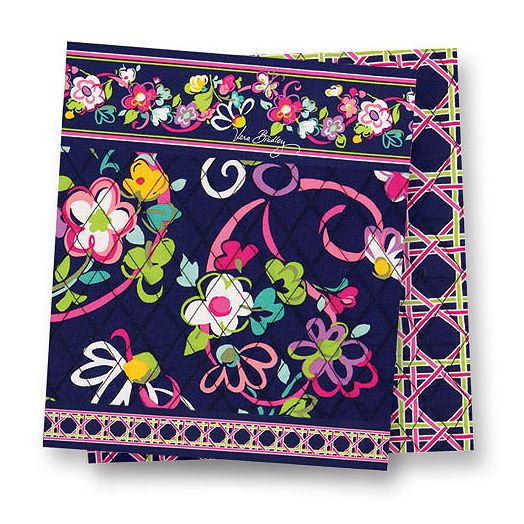 Looking at it now...I may or may not be in love. It reminds me of Ribbons with the color scheme. I see the dark blue background, the pinks, that teal green, and white. I bet when we get the actual swatch for PP they will have the same colors. It's the colors that are doing it for me. You all know I don't love paisleys, but it's the colors they use in them that make the difference.
 Fanfare I still love! Vera is in need of a new black and white pattern, right? The last one was Night and Day(I'm not counting Camellia, there was a lot of grey in that), which is now retired. Night and Day was black and white and that was IT.
Well Fanfare fits the bill! It's style is what I like to call fancy-pants, it's quite elegant, to me at least. Yes, it has a small splash of yellow but it's still simple enough. I can see this being a nice accessory print for a nice night out. It's very subtle, not busy like some of the others.
Unfortunately she didn't have a photo for Flower Shower. I haven't see it on anything yet...so right now it's still thumbs down for me. I didn't like it when I saw it, but maybe I'll be pleasantly surprised :-)
No comments :
Post a Comment